Halftone Effect: What It Is and How to Make One Online
A halftone turns tones into dots, where big dots read as dark and small dots as light. In Glyph Studio, open your image, choose the Halftone style, set Dot Size, Screen Angle and Mode (Mono, CMYK or RGB), then export a PNG at up to 4×.

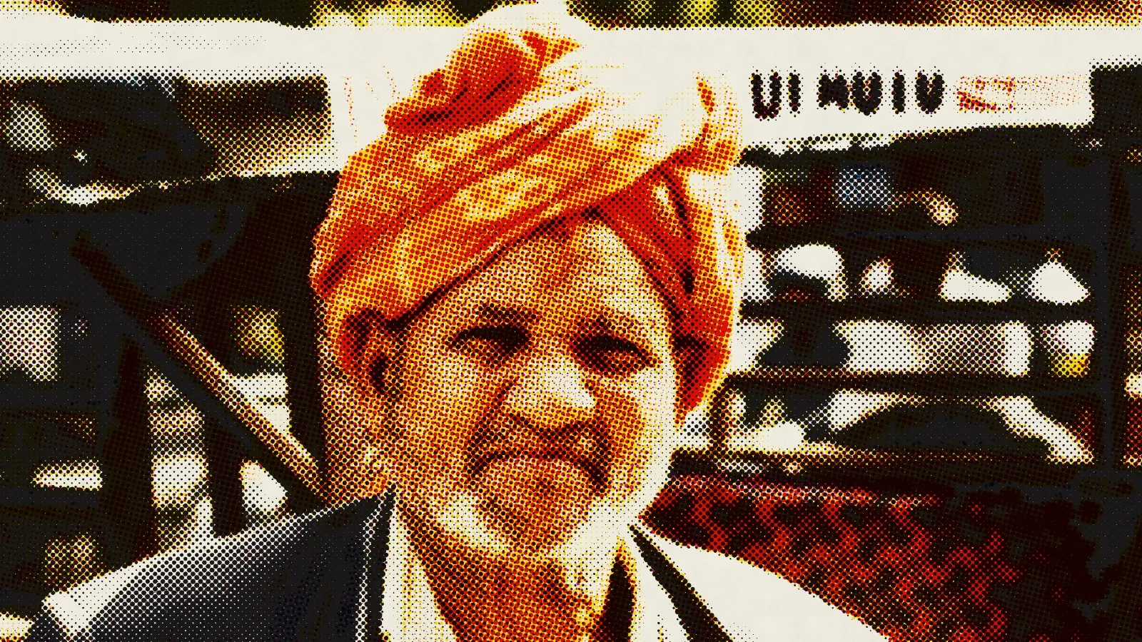
Look closely at an old newspaper photo and it falls apart into dots. That's a halftone, and it's one of the most borrowed looks in design. Posters, album covers and pop art all use it, because it says "printed" the moment you see it.
Why halftones exist
A printing press can't print grey. It either puts ink on the paper or it doesn't. For the first century of mass printing, that meant photographs couldn't go into newspapers at all; they had to be redrawn as engravings.
The halftone solved this by faking tone with dots. Print many small dots and the eye reads a light grey; print bigger dots that nearly touch and it reads dark. The New York Daily Graphic printed an early halftone photograph in 1880, and through the 1880s and 1890s inventors such as Frederic Ives, Georg Meisenbach and the Levy brothers made the process practical with ruled screens. Within a few decades, photos were everywhere in print.
Colour printing does the same thing four times: cyan, magenta, yellow and black (CMYK) screens, each rotated to a different angle so their dots don't clash into moiré patterns. That rosette of coloured dots is what you're recreating when you make a halftone effect.
Make a halftone effect, step by step
- Open Glyph Studio in your browser. There's nothing to install.
- Drop in your photo, paste it, or open it from Lab.
- Choose Halftone. Search "Halftone" in Find a style, or open the Ink & Press group.
- Pick a Mode. Mono for a one-ink newspaper look, CMYK for magazine colour, or RGB for the dot pattern of a screen.
- Set Dot Size and Screen Angle, then fine-tune Contrast and Dot Gain.
- Export (⌘E) a PNG at 2× or 4× for print, or an MP4 if your source is a video.
The settings, explained
Mode: Mono, CMYK or RGB
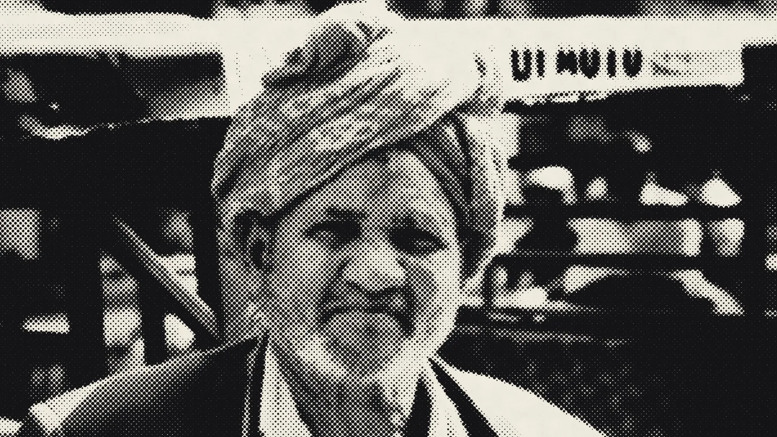
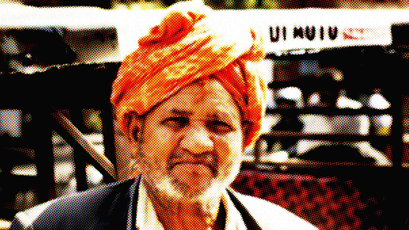
Mono is the classic newspaper look. You can change the Ink and Paper colours, so a navy ink on cream paper or white on black is one click away. CMYK separates the image into four inks with their own screens. RGB builds the image from red, green and blue light instead, which reads more digital.
Dot Size
Dot Size sets the size of the halftone cell, from 3 px to 48 px. Small dots (4–6 px) look like a real print seen at reading distance. Large dots (12 px and up) make the dots the subject, which is the pop-art look.
A useful way to think about it: printers measure screens in lines per inch. Newspapers ran around 85 lines per inch and glossy magazines around 133–150. The coarser the screen, the more "printed" the image feels.
Screen Angle and Dot Shape
Screen Angle rotates the dot grid. 45° is the standard for one-colour work because the eye notices diagonal patterns least. In CMYK mode the four screens are offset from each other automatically, which avoids moiré.
Dot Shape changes the mark itself: Round for classic halftone, Diamond for a sharper engraved feel, and Line for a line screen like old banknotes and etchings.
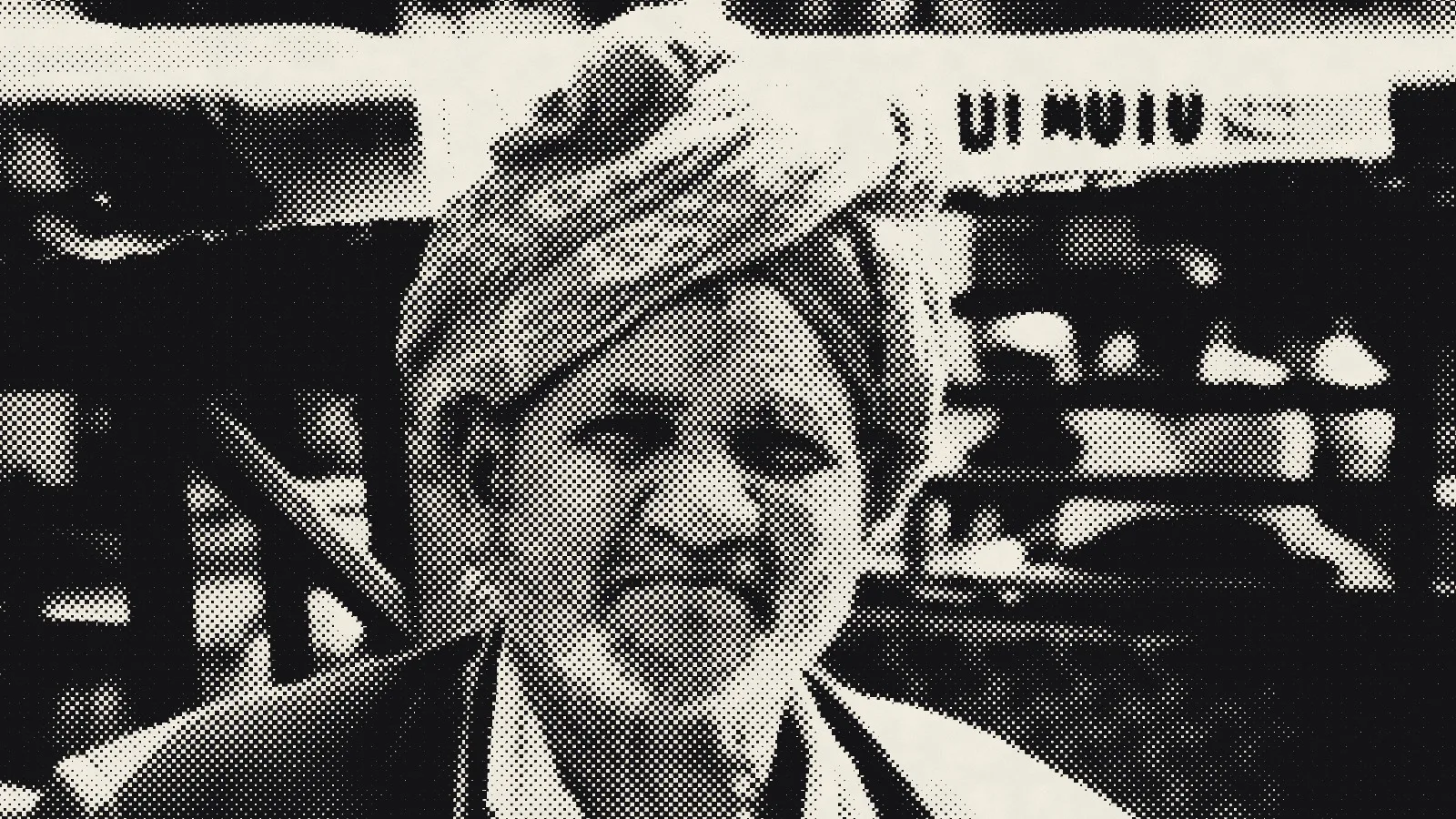
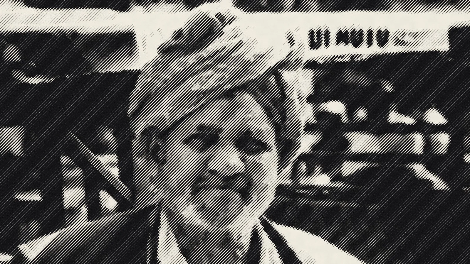
Contrast, Dot Gain and Ink Roughness
- Contrast decides how hard the image separates into light and dark. Raise it for punchy posters.
- Dot Gain imitates ink spreading into paper. Positive values make everything heavier and darker, as on cheap newsprint.
- Ink Roughness breaks up the clean edges of each dot so it looks printed rather than computer-drawn.
Misregistration
On a real press the colour plates never line up perfectly. Misregistration (in CMYK and RGB modes) shifts the colour screens slightly apart, which gives the slightly-off, riso-like charm of cheap prints.
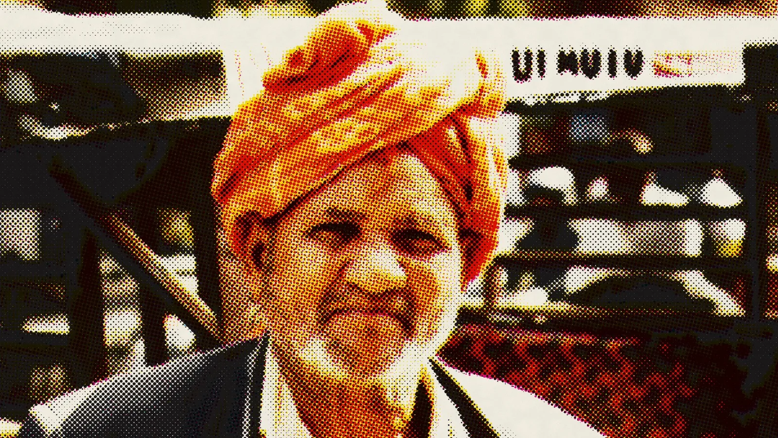
Tips for printing halftones
- Export big. Use PNG at 4×. A halftone is all edges, and resizing it later blurs the dots.
- Match the dot size to the viewing distance. A poster seen from across a room can take much bigger dots than a postcard.
- Mind the moiré on screen. Very small dots can shimmer when the image is scaled down on a phone. Bump Dot Size up a little for social posts.
- Pick photos with clear light and shadow. A face lit from one side halftones beautifully; a flat, overcast photo turns to grey mush.
Halftone has two close relatives worth knowing: dithering, which fakes tone with patterns of pixels instead of dots, and ASCII art, which does it with characters. The history of halftone and five other crafts is in Every style comes from somewhere.
FAQ
What is a halftone effect?
It's an image built from dots of different sizes instead of smooth tones. Large dots read as dark and small dots as light, which is how printing presses reproduce photographs.
What's the difference between Mono and CMYK halftone?
Mono uses one ink, like a black-and-white newspaper. CMYK uses four overlapping dot screens in cyan, magenta, yellow and black to reproduce colour, like a magazine.
What dot size should I use?
Use 4–6 px for a realistic print look and 12 px or more when the dots should be the style, as in posters and pop art.
Can I make a halftone video?
Yes. Open a video in Glyph Studio, choose Halftone and export MP4 or WebM. The dots are rendered fresh on every frame.
Is the halftone generator free?
Yes. Glyph Studio is free with no sign-up or watermark, and your images never leave your browser.